At the risk of sounding like Don Draper, there never was a golden age. We like to think that there was, however, to con ourselves that our inability to make sense of what currently mystifies us isn’t a failing of ourselves, but instead the failure of the mediocre present to live up to our standards – standards that were cultivated and honed in some distant golden age. An age when people were smarter and more polite, and in which, for the purposes of this essay, the advertising was better – more aesthetically pleasing, more artistically relevant.
Unfortunately, ninety-nine percent of the time, that sentiment is, at best, the rankest sentimental bullshit, and, at worst, a kind of generational jingoism that is as destructive, insulting and divisive as it is predictable and perennial.
How do we know that there wasn’t a golden age? Because every once in a while that one percent raises its elegant head and gives the lie to all the other pretenders. Because occasionally a retrospective book like Hathaway and Nadel’s Dorothy and Otis: Designing the American Dream comes along and shows you how frankly beautiful, effective, refreshing, artistic, and memorable advertising can be.
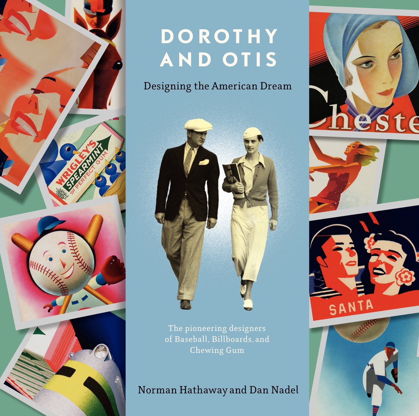
The “Dorothy and Otis” of the title are Dorothy and Otis Shepherd, a ridiculously talented and prolific husband and wife design team whose aesthetic was firmly imprinted on the 1930s and 40s, and beyond. Starting in San Francisco (where Otis – or “Shep” as he preferred – worked at the Foster & Kleiser ad agency alongside Diego Rivera) they eventually made their way to Chicago, where they found not simply a client, but a benefactor, who would keep them busy on a dizzying array of projects for decades.
That client was P.K. Wrigley, owner of Wm. Wrigley Jr. Company – makers of Doublemint Gum, owners of the Chicago Cubs baseball team, and landlord of Santa Catalina Island off the coast of California. And all of it fell under the design purview of Dorothy and Otis.
All of it. And that was a lot. Take just the chewing gum work:
“At the height of Wrigley’s 1930s market penetration, Shep’s designs appeared on twenty thousand billboards across the country in a single year. Every visual element of these objects was created or approved by him.”
Or the work for Wrigley’s corporate offices:
“This even extended to the décor of the Wrigley Building’s restaurant and its menus, done in glowing modernist forms in bright red and white.”
And almost all of it is stunning. For several reasons.
On the one hand there is the attention to making things that might be otherwise unimportant, beautiful. There are moments when you look at, say, scorecards they designed for the Cubs in the 1950s and are shocked by how beautiful they are. Scorecards! For a terrible baseball team! Who did that then? Who does that any more? They’re just scorecards!
And on the other hand, one can’t help but be amazed by the comprehensiveness of their designs for Santa Catalina island, where they built, from scratch, a design aesthetic that was at once Californian, modernist, Spanish, and yet none of those things – and that stretched from menus to road signs to billboards to uniforms for armies of employees. And where, through it all, the two of them were intimately involved, painting signage, planting trees, planning menus and orchestrating events and more.
And then there is the long shadow of their impact as designers. Those uniforms the Cubs are wearing tonight? Dorothy and Otis designed those. That ivy hanging on the outfield wall and the bleachers in Wrigley Field? That was Shep’s idea. The packaging for Wrigley’s Doublemint and Spearmint Gum that you can still pick up in a corner store? Yeah, they did that.
And all the while banging out hundreds and hundreds of posters, billboards, print ads and more, all illustrated by them, by hand, usually with the airbrush that they were transforming from a retoucher’s tool into an artist’s instrument.
So why? Why this attention, this comprehensiveness, this long shadow? Because they didn’t look at their business the way we do today. Nadel and Hathaway write “They shared a belief in the power of design to communicate ideas” and it’s true. And when you believe in that power, you pay attention to the details and to the broad scope. When you believe in that power, you, by definition, do not believe in simply generating content to fill up air time, websites or billboards. And thus you have a lasting impact.
Shep believed it was the least we could do. In a speech in Milwaukee he said “We as advertising men, owe the public something in return for the ads we force upon them.”
That has nothing to do with a golden age.
But everything to do with creating great work.
Dorothy and Otis: Designing the American Dream by Norman Hathaway and Dan Nadel was published by Harper Design on 11/04/14 – order it from Amazon here, or Barnes & Noble here – or pick it up at your local bookseller (find one here).
Please be advised that The Agency Review is an Amazon Associate and as such earns a commission from qualifying purchases
You May Also Want to Read: